
Charlotte Hayes, Beauty Editor.
There is a particular shelf in most bathrooms: four or five eyeshadow palettes, half of them barely touched, bought on a good-light day in a shop and abandoned within a week. The question that actually sends people back to a search bar is rarely ‘which palette is best’. It is closer to ‘why did this go patchy by lunchtime’ or ‘why does my crease look grey by mid-afternoon’.
One useful fact before you spend another euro: price correlates weakly with how a shadow performs on skin. What predicts performance is the ratio of pigment to binder in the pressed powder, something no packaging states outright but that you can learn to judge with your own eyes and a cotton pad in under a minute, standing at the counter.
This guide is not a ranking. It will not name a winner. It is a short course in reading a palette the way a chemist reads one, so that the next purchase, whatever the brand, is a more informed one.
- Pigment load, not price, decides payoff. A heavily milled, pigment-rich shadow needs only one light pass; a filler-heavy one needs three and still looks patchy by evening.
- Fallout is a binder problem, not a brush problem. Loose, chalky particles fall because the pressed powder was not bound densely enough, and no brush technique fully compensates.
- The inside of your wrist tells the truth that the back of your hand does not. Thin-skinned, warmer-toned areas show oxidation and creasing far sooner, and that is exactly where you should swatch-test.
Finding Your Undertone In Daylight

Shop lighting is designed to flatter stock, not skin, which is why a palette that looked warm and glowing under halogen can look muddy by the time you reach the bus stop. Daylight is the only honest light source, the way natural light is the only honest way to judge a wall colour before it dries.
Stand near a window, away from direct sun, and look at the underside of your wrist and your jawline together. Greenish or olive undertones generally sit better with warmer, earthier shadow tones; pink or blue undertones generally carry cooler, smokier ones better. This is a tendency, not a rule: plenty of cool-toned complexions wear warm copper well.
Self-test: swatch two contrasting shades on your inner wrist, step to a window, and look again after thirty seconds. If a shade reads as grey or ashy rather than warm or cool as intended, that is oxidation starting early, and it is worth noting for later in the shopping trip.
Reading Pigment Before You Buy
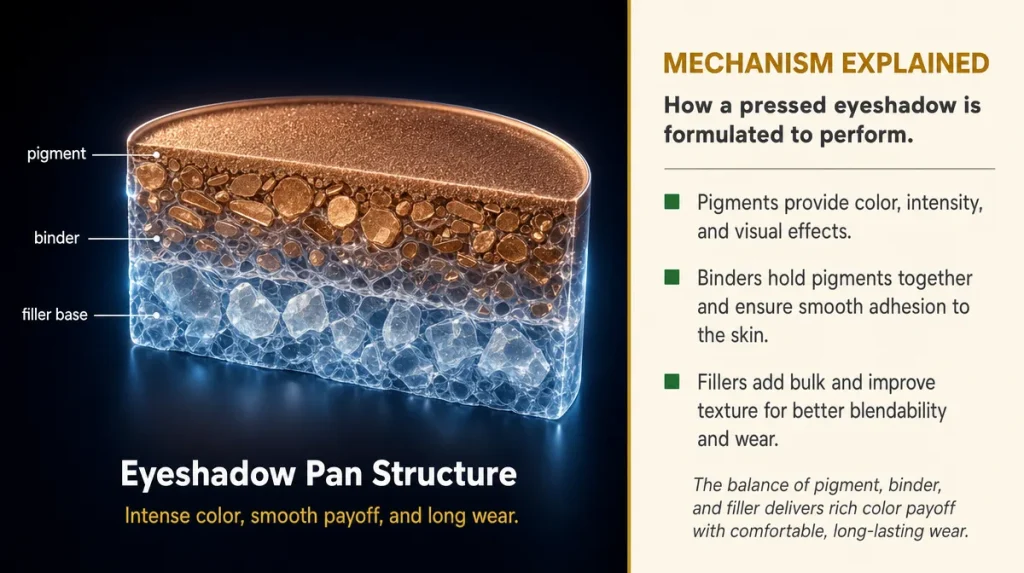
A pressed eyeshadow is, structurally, pigment held together by a binder and a filler, usually talc or mica base, pressed under heat into a pan. The more pigment relative to filler, the more colour survives once the product is diluted across the lid, blended, and worn for hours. This is the same logic as concentrated squash versus ready-diluted juice: tip the concentrate into water and the colour holds; tip in something already thin and it vanishes.
A cosmetic chemist would call this the pigment load, and the IFSCC’s congress papers on powder cosmetics have long treated particle size and pigment concentration as the two variables that predict payoff and wear, far more than brand or price point.
You cannot read a formulation sheet in a shop, but you can approximate the test. Swipe a clean finger once across the pan, no pressing, no double-dipping, and look at the colour transferred. A well-loaded shadow leaves visible, even colour on a single light pass. A filler-heavy one leaves a faint, uneven smear that needs three or four passes to look the same. That difference on your fingertip is the difference you will feel on your lid by the afternoon.
Why Fallout Happens And What It Tells You
Fallout, the fine powder that drops under the eye mid-application, gets blamed on brushes more often than it deserves. A dense brush with a loose hand can certainly make fallout worse, but the root cause sits in the pan, not the handle.
Think of it like a well-made biscuit versus a dry, crumbly one. A biscuit held together with enough butter breaks cleanly when you want it to and stays whole otherwise. One with too little binding fat crumbles the moment you touch it. Pressed powder behaves the same way: shadows compressed with enough binding oil or wax release pigment onto the lid without shedding loose particles everywhere else.
A rough shop-floor test: tap the pan gently, pan-side down, over a dark surface or the back of your own hand. A fine dusting is normal for any powder product. A visible shower of loose colour, or chalky residue left behind on your fingers after one touch, suggests a formula that will keep shedding onto your cheeks through the day, however careful your brush technique.
This matters more for darker, more pigmented shades, which typically carry a higher dye load and are statistically more prone to fallout than pale shimmer tones, a pattern several formulation chemists have noted in published work on powder cosmetics stability.
Where Budget Ranges Actually Cut Corners
Cheaper palettes are not inherently worse, but when manufacturers do cut costs, the cuts tend to land in three predictable places. The first is milling time: pigment needs to be ground finely and for long enough to disperse evenly through the binder, and shortening that process leaves larger, unevenly distributed particles that look patchy and feel gritty under a finger.
The second is the binder itself, swapped for a cheaper, less stable oil that breaks down faster under warmth and movement, which is part of why some shadows seem to vanish by mid-afternoon regardless of primer.
The third is shade consistency between batches. A well-run laboratory calibrates colour output precisely between production runs; a less rigorously run one allows noticeable drift, so the taupe you bought in March is not quite the taupe you buy again in October. None of this is scandalous. It is simply where cost gets taken out of a product, and it explains more about real-world performance than any marketing copy on the box.
What Realistic Wear Actually Looks Like
Marketing language promises all-day wear as though it were a fixed property of the product. In practice, wear time depends heavily on the wearer: oil production, eyelid movement, humidity, and whether a primer was used all shift the outcome by hours in either direction.
A fair benchmark, drawn from general guidance that consumer-testing bodies across Europe have published on cosmetics performance, is this: a reasonably well-formulated shadow should hold core colour and shape for six to eight hours on normal skin without primer, and visibly longer with one. Creasing in the lid crease itself, rather than general fading, usually appears first and fastest on oilier skin types, often within three to four hours.
Judge a new palette over a full day, not a few hours in a shop or at home in front of a mirror. Apply in the morning, note the time, and check again at midday and again in the evening under the same light you checked it in originally. Genuine fading will show as a flattening of colour intensity rather than disappearing outright; genuine creasing will show as a thin line sitting exactly in the fold of the lid. Both are measurable, specific, and far more useful than a word like ‘long-wear’ printed on a box.
Marketing Words Worth Questioning
Certain phrases on packaging describe an intention rather than a tested outcome, and it helps to know the difference. ‘Blendable’ describes texture under ideal conditions, typically tested at room temperature with a fresh brush, not necessarily how a shadow behaves after it has warmed slightly on your skin. ‘Buildable’ simply means the formula can take repeated layering without caking badly, which is a genuine and checkable quality: apply three light layers in the shop and see whether the fourth still looks clean or starts to look cakey and dry.
‘Velvet finish’ and similar textural language describe the particle size of the powder, generally finer particles feel smoother, but finer particles can also mean a more fragile pan that chips and crumbles more easily in transit, a trade-off packaging rarely mentions.
Words to treat with more scepticism are anything implying permanence or near-total durability, since no pressed powder product currently on the European market is immune to oil, humidity, and the simple mechanical rubbing of an eyelid blinking several thousand times a day. Test the specific claim yourself rather than taking the adjective at face value.
Key Takeaways
A palette earns its keep through pigment load, not packaging. Judge it with a one-swipe swatch test in daylight, not under shop lighting. Expect some fallout from any powder product, but excessive fallout points to a poorly bound formula, not a clumsy brush hand. Longevity claims mean little until you have worn a shade through a full working day in your own climate and skin type. Marketing language describing texture is not a measurement; your own skin, under daylight, after several hours, is the only honest test.
Your Shop-floor Checklist
- Swatch in daylight, not under shop spotlights, and check again after thirty seconds for early oxidation.
- Swipe once with a clean finger: even colour on one pass signals good pigment load; patchiness signals filler.
- Tap the pan gently over a dark surface: heavy loose powder falling off signals a binder that will also fall onto your cheeks.
- Press a cotton pad onto the pan: shadows that crumble or powder excessively onto the pad are more likely to crease and fade by midday.
- Wear a swatch on your wrist for a full day before judging staying power on your eyes; skin oil and movement change everything.
- Treat words like ‘blendable’ or ‘long-wear’ as a starting claim to verify yourself, not a guarantee.
This article is general information, not individual cosmetic or medical advice.
Results and skin reactions vary by individual; patch-test new products where sensitivity is a concern.